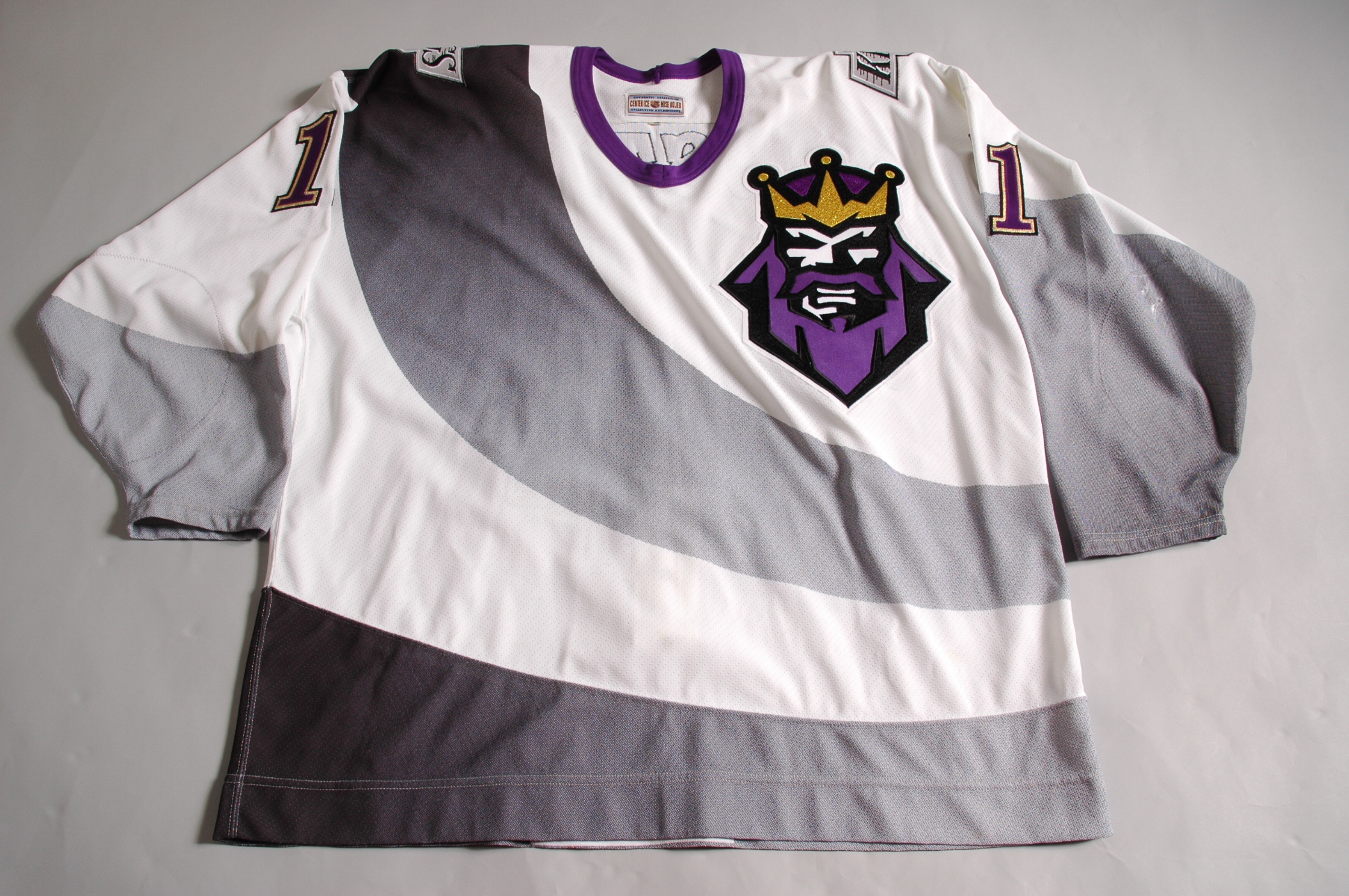
What is there to say about this joke of a uniform? The Kings were living large in the 90s with the world's best player Wayne Gretzky steering this franchise from out of the basement and into the rafters. The Kings finally got into the Stanley Cup Finals in 1993 but lost in devastating fashion to Montreal. The team's profile was on the rise and like most franchise's during this time period, they unveiled a brand new sweater and it ain't pretty.
The team changed their color scheme from the traditional purple and yellow to black, white and gray prior to the 1988-89 season. The idea here was to combine the past colors with the new ones to make a unique design that would encompass everything that is the Los Angeles Kings organization. The only problem is that it's so stupid and moronic that it is more of a disgrace to the team's name than a way of honoring it. As you might figure, the jersey received a moniker: The Burger King jersey. The King's cross logo, that normally sat in the center, was replaced by the goofy Scandinavian Burger King and put on the left side. The team's regular logo was placed on the shoulders instead. Gray swooping patterns are featured all over the jersey, which is an odd decision; what is it supposed to be, a sash? Come on L.A. The numbers are changed from black to purple with a yellow outline, making the numbers stand out but don't fit in with the rest. Even the gray doesn't match up throughout the jersey; there has to be at least 5-6 different shades in just one jersey. Getting back to "The Burger King", could you imagine a logo more ridiculous and absurd?
My final thoughts: There's a reason why it only lasted one season. One of the worst alternate jerseys EVER. But the impact of this jersey will live on as this video alludes to.
No comments:
Post a Comment