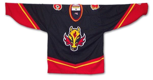
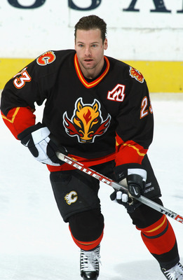
As you can see with this one, the team incorporated black for their primary color (a popular choice by most teams for their alternate jerseys) and scaled back on the use of red and yellow. The biggest change of course is the main flaming "C" logo being pushed to the shoulder patch and the invention of what has been called the "Flaming Horse". The idea came about because 1998 was "The Year of the Cowboy" so some dimwit decided it would be cool to create a logo featuring a horse that appears to have jaundice, sports devil ears and has flames shooting out of its nostrils to the side for some strange reason (not to mention the flame "birthmark" on the head). The only problem with this is that well it's a disaster. The proper line of reasoning would be to use a dragon because although they are mythical, they have been known to breathe fire (just saying). I'm actually surprised that Calgary kept this thing around for that long.
My final thoughts: Among their third jersey brethren, it ranks up there with one of the more poorly executed designs. The one cool feature is the patch designating captain or assistant captain seen here. Luckily they have kept that and got rid of the horse. I think maybe even Oilers coach Craig MacTavish might have hated it too; I mean look what he did to their mascot.
No comments:
Post a Comment