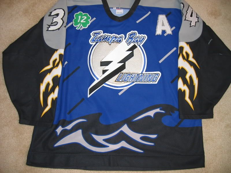
Keeping with the 3rd jersey vibe, may I present to you this unique and bold entry into the NHL history books with the Lightning's "Bolt Madness on the High Seas" concept. The jersey depicts a violent storm brewing out in the ocean, with large waves forming and rain pouring. What might sound great for a painting doesn't translate to a jersey. Quite frankly this jersey is ridiculous. What exactly does lightning have to do with a giant The gray shoulder pattern gives the contrast to the black and blue primary scheme but looks strange and out of place. The lightning bolts that emanate from the aforementioned shoulder pattern couldn't look any more tacky and cartoonish. Then there's the gray and black streaks on the front of jersey to designate rain...yikes. Add to that the goofy wave pattern on both sides of the jersey and you got yourself an absolute train wreck.
My final thoughts: Teams during the 90's went crazy with their 3rd jersey designs, including this one. It will go down as one of the most absurd and goofy jerseys in the league's history, and maybe sports history. Can't blame them for trying to get creative, but unfortunately the execution is a mess.
No comments:
Post a Comment