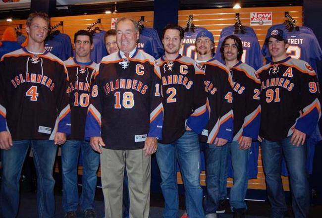
 More Islanders jerseys you say? Sure, I'll help you out on that regard. Here we have the new Islanders alternate jersey, a complete shift from what they've done in the past and a departure from what they normally don. Um what is this? The Islanders borrowed a recent trend in alternates of replacing their main logo with the team name and player number underneath. Not exactly an awesome idea. They re-introduced grey to their array after the disastrous Fisherman jerseys. They take up large portions of the shoulders and sleeves. The stripe pattern of grey, orange and old Islanders blue doesn't match up well and looks messy, like it was thrown together at the last minute. There are too many colors to deal with on the jersey altogether, like the primary black with the stripe patterns and then the orange names/numbers with white and blue trim. This is a classic "What were they thinking?" moment.
My final thoughts: It's not just me who thinks these jerseys are bad. Fans, critics and judging by this picture, some of the players don't think to fondly of it either. It is simply one of the worst alternates jerseys in league history, maybe even sports history. It's truly awful and I can't understand how a team can take so much pride in something like this.
No comments:
Post a Comment