Sunday, November 24, 2013

Vancouver Canucks 1989-97


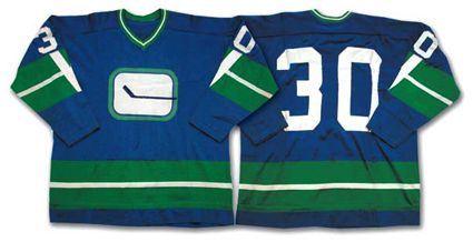
Here's another classic mess up by the Canucks. In the same vein as the "V" jerseys, Vancouver made some fine tuned adjustments and created the "Star Wars" type uniforms seen above. That's just one of the few nicknames for this "winner". You got the "Flying Skate", "Flying Blade", "Waffle Iron", "Plate of Spaghetti" and "Planet Canuck". Any name you give it, it's still going to be terrible. I guess they figured that the color scheme for the previous jerseys worked so they kept that together minus the "V's". The logo is odd because it looks like a planet, a skate with a blade that says Canucks or just a mixture of lines and the team name thrown in. Minus a thousand points on that one Alex. Although this jersey doesn't have a nameplate, they used the same gold color that is featured here with the stripes and numbers. The home jerseys were changed to white during this time period so at least they got something right.

My final thoughts: The combination of the same colors and the new logo still make this a stinker. The only thing that would make these better is wiping them from the history of NHL jerseys along with the V uniforms.

Vancouver Canucks Home 1978-85


The first major transition for the Canucks organization was their switch from the "Stick in a Rink" design to the terrible "Giant V" look. Along with the change in logo, the team also drastically altered their color scheme from blue, green and white to the standout gold, black and orange. According to the designers of this whooper of a jersey, the giant "V" and the subsequent "V's" along the rest of the uniform stand for Victory and not Vancouver. Kind of an interesting considering that the Canucks didn't win very often during their time with the dreaded V, compiling a record of 197-264-99 in that span.The fact that it takes up most of the jersey speaks to its ineffective artistic ability. The worst thing about these jerseys really is the color scheme. Who in their right mind would think that gold, orange and black would actually be effective? Especially when you make a gold a primary color (not a good idea). What exactly is there to like about this? Like a few of the other jerseys I've gone through, the color scheme is really distracting and downright rude. It hurts my eyes just looking at this thing. The away jerseys aren't any better; instead of gold it's all black. Truly an awful design for (at the time) an awful team.

My final thoughts: I have said that there are some jerseys here that I've analyzed to be some of the worst in NHL history. Well now I'm telling you THIS is the WORST jersey in NHL history by far.

Saturday, November 23, 2013

Vancouver Canucks 1970-78

Now we get to the team with the most prolific jersey history in the NHL, the Vancouver Canucks. Vancouver came in prior to the 1970-71 season but has left a huge impact on the league as far as their uniforms are concerned. The team has gone through 13 changes to logos and color schemes; some good and some not so much. First up: the team's original jerseys from 1970-78. Although there were a few alterations during those seasons (the first season they had a different stripe pattern on the sleeves and the latter ones featured names for the first time), the overall look stayed the same. Given the nickname  the "stick in a rink" jerseys, these uniforms went with a basic appeal: solid blue, green and white colors and a simplistic logo that when you look closer the stick gives the background the look of a giant "C" for Canucks. One dominant stripe forms on the bottom and sleeve areas that are accented by other colored stripes (normally one on each side) to again appeal to the simple design.

My final thoughts: Quite honestly these are the best jerseys they've come up with. I've harped on a few teams for minimalistic designs but in the case of the Canucks, they have a pretty solid foundation. Obviously they are a hockey team and have a logo that forms a "V" sort of and a definite "C". These jerseys were brought back by the squad in 2006 in a variation of the original as an alternate. They are also available as a part of the NHL's throwback Heritage collection.

Thursday, November 21, 2013

New York Islanders 2011-present

More Islanders jerseys you say? Sure, I'll help you out on that regard. Here we have the new Islanders alternate jersey, a complete shift from what they've done in the past and a departure from what they normally don. Um what is this? The Islanders borrowed a recent trend in alternates of replacing their main logo with the team name and player number underneath. Not exactly an awesome idea. They re-introduced grey to their array after the disastrous Fisherman jerseys. They take up large portions of the shoulders and sleeves. The stripe pattern of grey, orange and old Islanders blue doesn't match up well and looks messy, like it was thrown together at the last minute. There are too many colors to deal with on the jersey altogether, like the primary black with the stripe patterns and then the orange names/numbers with white and blue trim. This is a classic "What were they thinking?" moment.


My final thoughts: It's not just me who thinks these jerseys are bad. Fans, critics and judging by this picture, some of the players don't think to fondly of it either. It is simply one of the worst alternates jerseys in league history, maybe even sports history. It's truly awful and I can't understand how a team can take so much pride in something like this.

New York Islanders Alternate 2002-07


Speaking of alternates, check this one out! The prized "pumpkin" of the batch so to say. Due to an inability to do anything right during this era, the team unveiled these awful monstrosities. Doesn't it hurt the eyes just looking at it? Orange has always played a smaller part in the Islanders jersey history but they decided to make most of their uniform a bright version of it. Then there's the jagged line design which I'm not really sure what it's supposed to be or represent but looks ridiculous. How could you use that for both sides of the jersey? It's extremely distracting that's for sure, between the giant sickles and the offensive use of orange, I'd say you got yourself a real winner right there.

My final thoughts: Normally it's pretty tough being an Islanders fan because of their history of being lackluster or their issues with management and getting rid of players before they have a chance to become great. But their history with jerseys, especially alternates, has been just as rough. Definitely one you should steer clear of.

Carolina Hurricanes Alternate 2008-Present


The Hurricanes were one of the few clubs that had yet to produce an alternate jersey in their existence prior to 2008. The idea was set in motion and what came out of it was this. To say it's uninspired is an understatement. The team basically transplanted black into the same design used for their home and away jerseys but switched out the logo. The only differences are the red colored numbers and the extensive use of grey (which is featured sparsely on the other ones). Anyone who knows about hurricanes or lives in an area where hurricanes roll through on a regular basis will understand the new logo of the hurricane warning flags. But to anyone else, they will think it's dumb to have a giant flag on the front of the jersey. The shoulder patch has the 'Canes normal logo but in negative color which is one of the only good features here. The white border around the numbers is a nice touch too.

My final thoughts: The Hurricanes waited over ten years to come out with a 3rd jersey and settle on this? I don't get it, and neither do most fans.

Winnipeg Jets 2011-Present


When comparing the old Winnipeg Jets jerseys to the new ones, you have to put into account that there was a difference of 15 years from the time they relocated to Phoenix to when they got their team back. The concept here was to create a new image, one that was updated and streamlined. Most fans wanted the organization to bring back the old unis, which would have been a great idea. Instead, they designed these snoozers. Borrowing aspects of the Canadian Air Force's logo, the Jets placed a basic looking fighter jet over top of the Maple Leaf, the country's most well known symbol. The only problem is that it's borderline copyright infringement. The color schemes almost blend into each other as well with the dark blue and light blue. The lettering on the back is really small too so it's tough to see what the name is. I also think it's strange that the team logo, which is the symbol for the club, is small and almost off center.

My final thoughts:  The Jets were better off just bringing back their old jersey.


Sunday, November 17, 2013

New York Islanders Fisherman 1995-97


Trust the Gorton's Fisherman! That's what plenty of people were saying when the New York Islanders, in an attempt to redesign their identity, came up with this hysterical mockery of a jersey during the mid 90s. The team's original logo was pretty simple; a circular pattern with NY Islanders written inside superimposed over a diagram of Long Island, New York. Instead, the team went with the angry Fisherman wielding a hockey stick for 2 years. The team colors also changed during this time, from navy blue and orange to a plethora of colors including the previous two along with silver and turquoise. The strip patterns on the older jerseys were changed from straight to wavy and the nameplate featured the same pattern. They also added a shoulder pattern with wavy strips and a lighthouse logo on the blades. It certainly has an interesting vibe to it, maybe a stoner type vibe with the wavy patterns and the ridiculous amount of colors.

My final thoughts: One of the most ill-conceived designs in NHL history. I'm not sure why they wanted to switch from the original logo and jerseys, they're pretty nice compared to this. As you may imagine these jerseys were not well received by the Islanders fans or critics. Needless to say, the Islanders were harassed and they became the butt of many jokes because of these jerseys and the teams they fielded during this time (they played just as poorly as this jersey was designed).

Tuesday, November 12, 2013

Phoenix Coyotes Alternate 1999-2003


One of the NHL's most tumultuous franchises is the Phoenix Coyotes. Since joining the league in 1996 (relocating from Winnipeg, more on that tomorrow), the "Desert Dogs" has finished with 10 seasons of a .500 record or better while having 6 losing seasons. They've had issues with ownership and were even being financed for a couple of seasons by the NHL itself in order to keep the team afloat. There have been many rumors about possible relocation due to the dwindling attendance numbers. Maybe they should re-introduce this ambitious and colorful alternate jersey.

Taking inspiration from the area, the team set out to create a desert motif with drastic colors and designs. The original logo of the hockey playing coyote gets a head shot for this particular jersey, making it front and center. The green color that was used as an accent color becomes the main shade here and the sleeve patterns are changed to include mountains, desert and a cactus. A secondary logo for the team has been the crescent moon so their incorporation of said logo into the bottom portion of the jersey is a nice touch. 

My final thoughts: While it has been bashed by fans and players alike, I think it's interesting. Only an expansion team like the Coyotes could come up with an idea for a jersey using little used colors like dark green, purple and burnt orange. I have to give them some credit for coming up with an outrageous design. Thumbs up.

Monday, November 11, 2013

St. Louis Blues Alternate 2008-Present


St. Louis has been pretty modest with their jersey designs since entering the NHL in 1967. There was a period of time during the 90s when they experimented with different color schemes (needless to say they went back to their originals) but other than that the Blues haven't changed much, no less introduce a third jersey. Well following the success of Pittsburgh's Winter Classic circular logo uniform, it seemed like every team in the league wanted to adopt something similar. The Blues put together this gem prior to the 2008-09 season. The jersey makes good use of navy blue as its primary color, features a small Blues logo with the famous Gateway Arch lurking in background while the team name appears above and below in the circular pattern. The team's regular "Blue music note" logo makes an appearance again on the shoulder patch. I also really like how easy it is to read the numbers and names on the jersey due to the white color and bold font. The jersey isn't busy either like most alternate jerseys are; it only needs what is absolutely necessary. 
My final thoughts: Definitely one of the best alternates out there right now. Like most teams, the Blues tend to wear their 3rd jersey quite frequently at home games and I think they should continue that tradition. If the Blues ever get into a Winter Classic game, I certainly hope they will stick to their guns and choose this instead of coming up with something that looks like this.

Saturday, November 9, 2013

Dallas Stars 2013 Home Jersey

The Stars got a new owner prior to the 2011-2012 season so they decided that the team would make a few changes. There were plenty of those from players to people in management positions but the team waited to unveil the new team logo and uniforms. After two seasons under new owner Tom Gagliardi, the Stars revealed this sweater as their new home jersey. The emphasis was on the team's re-establishing their identity with an overabundance of green. While I admire their ability to improve over previously lame jerseys, I can't help but question the change in logo and the choice of green. I actually liked the earlier forms of the Stars jerseys, they were unique and have yet to be replicated in good taste. However, I don't understand how turning the team into a bunch of green Jolly Ranchers is going to improve upon their image. I'm not a big fan of the new logo either, it looks too much like a Chinese throwing star that they slapped a "D" on.

My final thoughts:  I think Dallas certainly had the right idea, they just executed it poorly. If they were to bring back the old Stars color scheme that would work better. The negative color shoulder pattern makes it a little too much green where maybe white or black should have come into play. The lettering is an issue too because the player names are scrunched together and way too small. Kind of goofy looking if you ask me.

Friday, November 8, 2013

New Jersey Devils Home 1982-1992


The Devils got their start in the NHL after two previous franchises failed to be successful and had to be relocated. New Jersey got its Devils team after the Kansas City Scouts (1974-1976) and Colorado Rockies (1976-1982) folded and settled in East Rutherford. The team name comes from the Jersey Devil, a mythical creature that supposedly lives in the Pine Barrens in South Jersey. The Devils settled on a color scheme of red, green and white; this gave way to the team's fans referring to them as "Christmas jerseys". The design is rather simple: the Jersey Devil logo placed inside an O, an interchange between red, white and green stripes and red lettering.

My final thoughts: For a team that hasn't changed much other than swapping the green for black, they put together a basic uniform. I actually prefer the green, red and white pattern though because so many teams put black into their repertoire so it's better to have something unexpected. Kudos to them for bringing back these jerseys for the St. Patrick's Day matchup against the Pittsburgh Penguins in 2010. 

Wednesday, November 6, 2013

Washington Capitals 1974-95


Another patriotic jersey to throw into the mix. The Capitals wanted to embody the nation's colors in their design, creating the stars and stripes sweater provided above. The jersey is very appealing; the stars are positioned on the sleeves and near the neck region, the stripes encompass most of the edges while a simple logo of a small Washington resting on top of the large Capitals that has an uppercase L for a hockey stick. The shoulder pattern features contrast colors, so for the red jersey, that area is white and for the white jerseys it's red. Simple but effective if you ask me.

My final thoughts: I think this jersey is great. The Capitals haven't always had a whole lot of success, especially during the era when they wore these jerseys. I'm glad they brought them back for their Winter Classic matchup against Pittsburgh in 2011.

Colorado Avalanche 1995-2007


I brought up the Nordiques the other day with one of my posts. The team that came out of that club's demise was the Colorado Avalanche. Since their inception, the Avalanche have won 2 Stanley Cup championships (their first one coming in the team's first season in the NHL!), 8 divisional titles and has an alumni class featuring great hockey players like Peter Forsberg, Joe Sakic, Adam Foote, Raymond Bourque and Patrick Roy. The team has kept their jersey style simple; in fact they have never altered their home or away jersey (although they have created two alternate jerseys). They are the only team that could rock a spectrum of colors like burgundy, steel blue and silver. The team's logo is fantastic; it uses an avalanche of snow forming a C around the stationary A. If you look close, the edge of the "C" there is a puck shooting out of the snow. The jagged pattern featured towards the bottoms and sleeves give it a nice visual aesthetic too, almost like it forms mountains. And how could I forget the team's secondary logo of a Sasquatch foot? Classic.

My final thoughts: One of my personal favorite jerseys without a doubt. I was a big fan of their team during the 90s and early 2000s because of the amount of talent they had plus the jerseys are awesome. Great logo, great color scheme, great jersey for a great team. Another must have for hockey fans.

Tuesday, November 5, 2013

Chicago Blackhawks Winter Classic 2009


The Winter Classic in Buffalo was such a success that the league brought it back for another go around this time in Chicago. The Blackhawks are an Original Six team and have been deep seated in tradition so when I heard they were going to host the Winter Classic, I was curious as to what they would come up with. For their game at Wrigley, they borrowed from their jersey design from 1935-37 and ended up with this. Taking inspiration from the Penguins Winter Classic jersey, they modernized the circular logo pattern and although the jersey may be mostly black, the mid section and sleeves feature tan. Unlike most jerseys were the numbers tend to blend in (especially the dark ones), the numbers stand out on top of the tan and red background. Some might say it's too much to clump together, but I disagree.

My final thoughts: As far as Winter Classic jerseys go, this is the best one I've seen thus far. It stays true to the team's primaries of black and red but with the added tan from their early days, it gives a new look for the fan's palate. There's a bad side and a good side: The bad was that unfortunately they lost their game to the Detroit Red Wings 6-4 but on the good side, they officially made this sweater their third jersey and have worn it frequently at home games.

2008 Pittsburgh Penguins Winter Classic Jersey


The Penguins participated in the first ever Winter Classic game on January 1, 2008. For those of you who aren't familiar with the Winter Classic, I can explain. The Winter Classic is a game (this season will feature up to 6) that is played in an outdoor setting, usually  in a baseball or football stadium. The first game's matchup was between Pittsburgh and the Buffalo Sabres at Ralph Wilson Stadium in New York. Pittsburgh won the game 2-1 in a shootout and wore these jerseys in their victory. The color scheme and the overall jersey design harkens back to the days when the Penguins first came into the league in 1967. It certainly is abnormal to rock a powder blue sweater but the design does fit together nicely. The dark blue outlines definitely give the primary color that effect of popping out and the negative space used for the shoulder pattern was a nice touch.

My final thoughts: Although I don't particularly enjoy jerseys like this one, I do think it works out well and I'm always interested when a team decides to honor their history by creating a throwback sweater. Even the old fashioned lettering works in the jersey's favor and the circular logo on the front can only be synonymous with jersey patterns in the 60s and 70s. 

Monday, November 4, 2013

Quebec Nordiques 1991-95


The Nordiques belong to a distinguished group of teams that came over to the NHL following the collapse of their rival league, the WHA or World Hockey Association. Quebec's elaborate color scheme set itself apart in a field of teams that relied on contemporary tones. Possessing a simple logo (to this day I'm not sure what it's supposed to represent) and fleurs-de-lis, or spades, the Nordiques jersey is one of a kind. For their dark colored jersey, they went with a lighter bright blue, which might have been disastrous if not for how the other elements, like the white spades, the white lettering and the red logo and outlines. The team's poor record and financial issues led to their relocation to Denver in 1995. 
My final thoughts: Another great collector's piece from the Vintage Hockey selection. The Nordiques found some success during their time in the NHL, but the team's jerseys are prime examples of "best made simple" and serve as alternate jerseys from time to time for the team's current form as the Colorado Avalanche.  


Saturday, November 2, 2013

Ottawa Senators Alternate 2008-2011


Here we go, another alternate jersey to pick apart. The Senators offered up this bland uniform during the craze where most teams were putting names or nicknames on the front of their jerseys instead of the logo (prime examples being the newly crowned Anaheim Ducks or the Dallas Stars). They are familiar to the third jersey idea, in fact they had previously created 2 alternate jerseys prior to unleashing this one. While the 2 previous alternates were successful and one even became a future design for the club, this one is boring. The Senators replaced their updated logo with the simple "Sens" and made the jersey all black except for a checkered sleeve pattern of red and white. The white lettering and numbers stand out better than their normal jersey makeups do but it seems unbalanced, with enormous numbers but really small letters. As you can see depending on the length of the players name, it even runs into the arm pattern so it doesn't look all that great.

My final thoughts: One of the more forgetful alternate jerseys out there. The Senators replaced this one with a throwback of sorts, using most of what they had going here for the new one. While it might have been a good idea at the time, the overuse of the team name on the front is lame. Third jerseys are supposed to be radical or has a sense of something new but retaining a part of the team's identity. With this one, it's like the creators had a deadline that came and went so they threw the most basic concept at the manufacturer. Try again Ottawa.

Los Angeles Kings 1977-80 Purple


Even before Anaheim changed the NHL jersey landscape with their unique uniforms, another fellow Californian club came into the league bearing jerseys with purple and yellow as the primary colors. The Los Angeles Kings came into the NHL in 1967 along with five other clubs during the league's first large expansion era. The inspiration for the team's colors came from team owner Jack Kent Cooke, who also happened to own the LA Lakers at the time. The team's simple design pattern for their away jerseys featured purple as the primary, with yellow stripes on the sleeves and bottom (per usual) but utilizes the bright yellow in a great way for the name and number section. Far too many teams have gone with another color when they design the numbers and name so it's awesome that they stuck with Kings yellow to make those areas pop and stand out. It might have been borrowed by another sports team but the concept gave the Kings an identity in the NHL. The other great aspect about this jersey is the King's crown logo; the kind of detail that is put into it deserves a lot of recognition and praise.

My final thoughts: Like the Mighty Ducks, the Kings have been successful with their purple unis. The popularity of the jersey rose so much during the last decade that the team has brought back the jersey to showcase in home games. Definitely a must have and a keeper for all jersey fanatics.

Wednesday, October 30, 2013

Mighty Ducks of Anaheim Away 1993-2006

I previously discussed the Mighty Ducks venture into alternate jersey territory with Wild Wing. I also included the history surrounding the team and its inclusion into the NHL. Now we get to take a look at the team's original jersey scheme. The team's away jersey, that saw action from 1993 to 2006, featured an interesting blend of colors. The team's primary was eggplant (dark purple) with an accent of jade, grey and white. The logo is of a duck mask layered over top of two crossed hockey sticks, a black shaded area (possibly a puck) and a grey triangular background. The slant on the stripe pattern is a unique feature and the use of jade for the outlines of the numbers is pretty cool. The shoulder patch shows Wild Wing enclosed in a circle with the team's name. Overall it's a design that succeeds because it doesn't try to copy other team's jerseys, it makes perfect use of new colors and has one great looking logo.


My final thoughts: Bring them back please! One of the only teams to ever pull off purple of a jersey scheme. The team is in its 20th season so they brought them back for one game but their new jerseys are lame and boring so why not replace them with these awesome jerseys? Just a suggestion. I know Ducks fans agree with me.

Monday, October 28, 2013

Edmonton Oilers alternate 2001-07


Much like the majority of the Canadian teams, the Edmonton Oilers tend to be traditional and stick to what suits them best. But like most teams during the time period, the team adopted this interesting third jersey prior to their season in 2001. The design can be credited to minority owner Todd McFarlane (yeah that Todd McFarlane of Spawn fame). The team's logo was replaced by a flying set of gears with an oil drop on the inside, the primary colors were changed from blue and orange to dark blue and silver and the fonts used for the name and number were changed to a futuristic font. The gears on the logo feature 5 notches to celebrate the team's 5 Stanley Cup Championships which is a pretty unique aspect.

My final thoughts: Where a lot of teams went wrong with their third jerseys, the Oilers did a great job coming up with a design that is different but memorable. Although a departure from their normal colors, I liked the combination of dark blue with the grey and white stripes. It comes together really well for it being a 3rd jersey. I've been critical of darker colored jerseys but this one is sharp and proves the point that alternate jerseys do have a place in sports.

Dallas Stars alternate 2003-2006


While we're on the subject of livestock...

Here's the infamous third jersey for the Dallas Stars, known affectionately as the "Mooterus". The concept came about because the Stars had the idea to incorporate the constellation Taurus into a jersey, but make sure that it makes sense. Well it didn't help much for the Stars because fans and even players hated the jersey. The Stars have always had a strong identity with their unique star shaped patterns but this choice was bad. I guess because they wanted to be clever. They must have thought a bull head with stars inside and a shooting star coming across the left horn would work out well right? I mean there are a lot of cattle ranches in Texas after all. But wait, where is the green? The black landscape gives it a dull look, accented with swooshing stripes of red, green and a slight yellow. The Stars, since their days in Minnesota, have been green and white but the decision to only use green on the sleeves and border proved their arrogance towards the team's history. And then the Stars logo is placed over top of the ugly red stripe pattern towards the wrist, um why? Just a total mess if you ask me.

My final thoughts: NHL teams insistence on designing alternate jerseys has led to plenty of terrible choices, including this one. The fact that they didn't realize the jersey had a logo that looked like a part of the female anatomy goes to show how smart the people were behind its approval.

Calgary Flames Alternate/Away 1998-2006

 
The Flames organization might have originated in Atlanta, but since its relocation to Calgary in 1980, the team has become synonymous with hockey in Canada. The team kept the original colors of the defunct Atlanta Flames and made a slight tweak to the logo, changing it from a flaming "A" to a flaming "C". The jerseys have remained mostly the same, with a small diversion during the 90s with a diagonal stripe pattern going up the jersey and resting under the team logo. Not until 1998 did they radically change their design...for the worse.

As you can see with this one, the team incorporated black for their primary color (a popular choice by most teams for their alternate jerseys) and scaled back on the use of red and yellow. The biggest change of course is the main flaming "C" logo being pushed to the shoulder patch and the invention of what has been called the "Flaming Horse". The idea came about because 1998 was "The Year of the Cowboy" so some dimwit decided it would be cool to create a logo featuring a horse that appears to have jaundice, sports devil ears and has flames shooting out of its nostrils to the side for some strange reason (not to mention the flame "birthmark" on the head). The only problem with this is that well it's a disaster. The proper line of reasoning would be to use a dragon because although they are mythical, they have been known to breathe fire (just saying). I'm actually surprised that Calgary kept this thing around for that long.

My final thoughts: Among their third jersey brethren, it ranks up there with one of the more poorly executed designs. The one cool feature is the patch designating captain or assistant captain seen here. Luckily they have kept that and got rid of the horse.  I think maybe even Oilers coach Craig MacTavish might have hated it too; I mean look what he did to their mascot.

Thursday, October 17, 2013

New York Americans 1930-38

One of the league's first expansion teams was the New York Americans, originating out of Manhattan. The Americans were established in 1925 and were New York's first professional hockey organization. Although they didn't achieve much and were an abysmal team on the ice, the Americans had one of the best jerseys around. During the early portion of the NHL's life, teams only wore one jersey so after an alteration to the original unis, the Americans performed in front of fans with this gem for 8 seasons.

A large spread of patriotism throughout the United States led to the creation of the franchise and its tributes to the nation's colors. Instead of a logo in the middle section, the team opted to use small script New York over top of a large script Americans. The jersey features the stars on the front and back, the red stripes along the sleeves and bottom section and a white mid section for the logo and number on the back.

My final thoughts: A great American jersey. Probably the most patriotic jersey ever manufactured and should have been worthy of use in the Olympics (minus the New York part of course). This is definitely a collectors item for any jersey fanatic out there.

Wednesday, October 16, 2013

San Jose Sharks Home/Away 1998-2007


The final team to cover from the league's Californian expansion is the San Jose Sharks. Entering the league in 1991, the Sharks have grown into one of the most popular franchises in the NHL. The team's fan base is one of the loudest and most loyal in the league and were considered so intimidating that the Sharks arena carries the nickname of the "Shark Tank". These jerseys were first born during the 97-98 season as an alternate but eventually became the team's go-to jersey for away games starting the next year. The arched name format and slim numbers are winners and the incorporation of a black arch on the front just adds fuel to an awesome fire. The Shark's logo is intense as it should be and the use of black and gray along the tops of the jerseys bring to mind the appearance of a shark. It makes for an intimidating presence on the ice. 

My final thoughts: One of my favorite jerseys from one of my favorite teams. I love the use of teal and the menacing shark logo. The team has done this jersey a great injustice since the team's "upgrade" in 2007. If it were me, I would love for the Sharks to bring back these jerseys and keep them full time (or maybe as an alternate). Lots of nostalgia involved with this uniform with a few of my favorite players (captains Owen Nolan and Patrick Marleau pictured here) putting this on game after game. Essentially the start of the franchise's success began around the time these jerseys were introduced.

Mighty Ducks of Anaheim Alternate 1995-96


Staying with the 90s alternate theme, another Californian team went with a dramatic design. This wildly entertaining addition to the 3rd jersey family was also given a nickname, "Wild Wing", after the team's mascot. The Disney owned Mighty Ducks were awarded a franchise in 1993 and named after the popular movie The Mighty Ducks starring Emilio Estevez as the coach of a hockey team made up of misfits who defy the odds and win a championship. The film was so well received by hockey fans that Disney made a huge decision to create a professional hockey team in Anaheim and give them the Mighty Ducks name. A cartoon television show accompanied the team's arrival, with "Wild Wing" serving as the protagonist.

The cartoon tie-in is a prominent feature on this jersey. On the front we see Wild Wing jumping through the ice, flying in the air with the home Mighty Ducks uniform on and wearing goalie equipment. The stripe pattern on the sleeve is the opposite of the home and away sweaters due to the main color of teal. The normal logo is placed on the shoulder patch and the stripe pattern that is featured on the backs of their other jerseys is done away with. The number/name font was changed to an artistic style, giving it a unique look. My opinion of this jersey is that it's absolute madness and almost comical, yet it does have an appeal. It's one of those "it's so crazy it just might work" type jerseys so I could be critical but I'm not sure if I should be.

My final thoughts: I was and am still a huge fan of the Mighty Ducks, both the jerseys and the movies (well maybe not D3). This jersey is one of the most unique ones I've ever seen and even though it caters more to children than adults, it is a pretty interesting design. Much like L.A.'s "Burger King", this jersey lasted only one season. It continues to be maligned however as this blog list shows.

1995-96 Los Angeles Kings Alternate


What is there to say about this joke of a uniform? The Kings were living large in the 90s with the world's best player Wayne Gretzky steering this franchise from out of the basement and into the rafters. The Kings finally got into the Stanley Cup Finals in 1993 but lost in devastating fashion to Montreal. The team's profile was on the rise and like most franchise's during this time period, they unveiled a brand new sweater and it ain't pretty.

The team changed their color scheme from the traditional purple and yellow to black, white and gray prior to the 1988-89 season. The idea here was to combine the past colors with the new ones to make a unique design that would encompass everything that is the Los Angeles Kings organization. The only problem is that it's so stupid and moronic that it is more of a disgrace to the team's name than a way of honoring it. As you might figure, the jersey received a moniker: The Burger King jersey. The King's cross logo, that normally sat in the center, was replaced by the goofy Scandinavian Burger King and put on the left side. The team's regular logo was placed on the shoulders instead. Gray swooping patterns are featured all over the jersey, which is an odd decision; what is it supposed to be, a sash? Come on L.A. The numbers are changed from black to purple with a yellow outline, making the numbers stand out but don't fit in with the rest. Even the gray doesn't match up throughout the jersey; there has to be at least 5-6 different shades in just one jersey. Getting back to "The Burger King", could you imagine a logo more ridiculous and absurd?

My final thoughts: There's a reason why it only lasted one season. One of the worst alternate jerseys EVER. But the impact of this jersey will live on as this video alludes to.

Monday, October 14, 2013

Oakland Seals


Time to go retro and shed some light on another failed NHL franchise. The Oakland Seals lasted all of 3 seasons, compiling a 66-118-42 record. The team name was changed to the California Golden Seals after the 1968-69 season. From their short span as an organization, the team made an impact. The logo features a seal with a stick resting inside a giant "O" for Oakland. The lack of detail given to the logo is interesting and the color scheme of light and dark green, yellow, black and blue surprisingly blends together. The jersey's main scheme of green with blue numbers and striping also meshes quite well. The idea of using blue for the numbers instead of traditional colors like white or black is a nice touch. I also enjoy the tie down laces on the top of the jersey.

My final thoughts: Like most former franchises, the Seals have made a name for themselves in recent years because of the NHL's Vintage Hockey collection. Acquiring a jersey like the one above is tough to come by so if you are an avid hockey fan, this would be a great piece to add to the collection. Overall it's simplistic, colorful (but not too much) and strays from the normal confines that normally perpetuate sports jerseys, making it a classic.

Tampa Bay Lightning 3rd Jersey 1996-1999


Keeping with the 3rd jersey vibe, may I present to you this unique and bold entry into the NHL history books with the Lightning's "Bolt Madness on the High Seas" concept. The jersey depicts a violent storm brewing out in the ocean, with large waves forming and rain pouring. What might sound great for a painting doesn't translate to a jersey. Quite frankly this jersey is ridiculous. What exactly does lightning have to do with a giant The gray shoulder pattern gives the contrast to the black and blue primary scheme but looks strange and out of place. The lightning bolts that emanate from the aforementioned shoulder pattern couldn't look any more tacky and cartoonish. Then there's the gray and black streaks on the front of jersey to designate rain...yikes. Add to that the goofy wave pattern on both sides of the jersey and you got yourself an absolute train wreck.

My final thoughts: Teams during the 90's went crazy with their 3rd jersey designs, including this one. It will go down as one of the most absurd and goofy jerseys in the league's history, and maybe sports history. Can't blame them for trying to get creative, but unfortunately the execution is a mess.

Toronto Maple Leafs Alternate 2000-08, 2008-10


The Toronto Maple Leafs have an illustrious history as an NHL franchise. They are one of the original members of the NHL club (Original Six), won 13 championships (which is 2nd league wide behind the Montreal Canadiens), and are the league's most valuable franchise with an estimated net worth of 1 billion dollars. The team's history played a part in the creation of this throwback jersey to serve as an alternate to their home and away sweaters. Going with the traditional Leafs style, the jersey features the detailed old school Maple Leaf crest and the blue filled neckline. I also think the use of slim lettering and numbers was a better way to go instead of the bold that is used for the home and away jerseys. The minimized emphasis on stripes for this jersey also works well because it doesn't clutter the space and is used for outlining purposes.

My final thoughts: Bringing back an old style almost always succeeds and this jersey is one of the front runners. It's a shame that they got rid of this one and replaced it with a simplistic dark jersey that mirrors their home jersey.

Saturday, October 12, 2013

Florida Panthers alternate 2009-2012


Now when I was discussing the Panthers reputation of being terrible, it can all be summed up in the creation of this monstrosity. Ushered in in an era where most teams around the league loved introducing multiple shades of blue to their 3rd jerseys, the Panthers made a huge mistake. The team's logo is altered, the colors used don't match with the team's normal colors and patterns look bad. I'm not sure what possessed the creators to use powder blue for the shoulder and sleeve trim but it doesn't match well with the dark blue primary which happens to not be the Panthers normal blue shade.The logo features just a panther head that appears to be drawn by a young child because it looks cartoonish compared to the original. The team also incorporated the circular wheel with the logo and team name like a few other organizations did for their 3rd jerseys. The biggest problem here was the exclusion of red, which is what most Panthers fans relate to the most when they think of the team and its color scheme. Critics and fans alike were bothered with this jersey (if you can call it that), which more than likely led to its departure. Sometimes teams try too hard with 3rd jerseys; too hard that something like this gets manufactured and is panned by everyone.

My final thoughts: All in all a terrible choice for an alternate jersey. There's a reason why these types of jerseys don't get worn very often, and in this case, I can't blame any player who had problems putting this on for a game. In the end though they did serve a good cause and showed other teams that jerseys like this don't work.

1993-1998 Florida Panthers Home


The Panthers have been the butt of many jokes during their tenure in the NHL. The team has gained notoriety for being mediocre or among the league's worst but there have been a few bright spots. To the surprise of many people, the Panthers once made it to the Stanley Cup Finals in 1996 on the backs of a roster that featured past and present NHL all-stars like goaltender John Vanbiesbrouck, forward Scott Mellanby and defenseman Ed Jovanovski. They accomplished this feat while having only 3 seasons of experience as an franchise. Since that time however they have only made the playoffs 3 times in 15 seasons. The jersey that I chose to examine here was one of their originals and the one with the most success behind it. 
This home jersey created for the Panthers is one of the better white jerseys that I've seen. Like most teams it features a stripe pattern on the sleeves and bottom while adding a shoulder pattern to accentuate the upper portion of the jersey. The Panthers use brighter shades of yellow and red to make the jersey pop without being over the top and the blue helps keep it in line. The panther in the logo is pretty intimidating, which certainly went with how the team performed during its Stanley Cup run. I also like the team's alternate logo featuring a stick crossed with a palm tree in front of the sun as seen here
My final thoughts: It resembles a time when Panther fans could be proud of their team. The team made quite a few modifications during the years after their successful time period which didn't work out well. Although it may seem simple, that attribute is what makes this jersey work.  


Thursday, October 10, 2013

Blue Jackets 3rd Jersey 2010-Present

 
The Blue Jackets are the 4th and final team of the "new age" expansion era teams that I haven't covered yet. Columbus was awarded a franchise in 1997 but didn't start playing puck until the 2000-01 season. The team was named after the state's illustrious history with the Civil War. Ohio played a huge part in the Civil War by starting up 23 volunteer infantry regiments for the Union, creating some of the largest military bases at the time and producing some of the war's most prominent members such as Ulysses S. Grant, William Tecumseh Sherman and George Custer.

Why should I mention history when this blog is about hockey jerseys? Well I wanted to reflect the impact that the state's history has on the team, so much so that it created this classic 3rd jersey in 2010 to take over from the swooping stars and stripes alternate. (The logo from that original alternate sweater eventually would replace the team's old one from 2007 to the present day). The new logo features a circular design with a cannon and the team's name over top. Navy blue reflects the color of the original "Blue Jackets" and benefits from the use of lighter blue and white as complements.


My final thoughts: Definitely a great example of a 3rd jersey working out. It has a great reputation around the league and from critics as an excellent alternate and I have to agree wholeheartedly. Their meshing of history and hockey is really quite awesome, ranging from the team name to the use of a replica cannon at home games to signify goals and team wins. A must have for any hockey fan.

Nashville Predators Alternate 2001-07


I mentioned in the Sabres 3rd jersey article that the extended use of yellow for a team's alternate jersey has had some disastrous results. The Predators created this dud prior to their 4th season in the NHL in an attempt to bring a new look to the team as well as sell merchandise because the team's popularity had not taken off as well as they had hoped. The end result was quite frankly a train wreck. Instead of using the team's gold yellow color, they opted to use a mustard yellow tint for the primary color (pretty bad choice on their part). The jersey features dark blue on the areas under the armpit and ribs that connect to swirling gray and white stripes inside the aforementioned blue color. This addition is awkward looking and adds to the jersey's ineffectiveness. The final straw that broke the camel's back here is the modification of the Predators logo. Now I think that the team's original logo is one of the better ones in the NHL; it's detailed, unique and intimidating. But on this jersey, the logo is turned into a caricature and a total joke. The saber tooth tiger here looks more like something you might find in the Ice Age films. Is "Gnash" smiling, staring off in a contemplative manner or trying his hardest to be serious? I can't tell and neither can most fans.
My final thoughts: The Predators have become a successful organization after dismissing this ugly sweater from their repertoire. They've gained credibility and have sustained a high rate of ticket sales since this jersey made its last appearance. Need I say more?

Tuesday, October 8, 2013

1979-85 Hartford Whalers

The Whalers started out as a team in the old World Hockey Association (WHA), which was a new league established to compete with the NHL. Although the WHA didn't last very long, the Whalers were brought into the fold when the NHL expanded in 1979. The team lasted 18 seasons as a member of the NHL, compiling a record of 534 wins, 709 losses and 177 ties. Even though their franchise numbers were bad, the team featured one of the more unique logos and color schemes during its tenure. And what better to examine than the team's original jersey.

Green is the primary color for the home sweater worn from 1979 to 1985 and it sure does work well. The sleeves feature an angular pattern with a blue stripe in between two larger white stripes. The bottom of the jersey also utilizes this stripe pattern. The logo combined with the colors and shoulder patch are what does it for me. The Whalers logo incorporates the letter W with a tail of a whale over top. In the negative space between the two, there appears to be a "H" for Hartford. The shoulder patch, seen more clearly here, is a relatively small and possibly confused whale affectionately named "Pucky". The diminutive whale was a staple on their jerseys during this time period, but were removed from the 1985-86 season until the team's demise in 1997. "Pucky" came back in a big way when the NHL Store decided to create a Vintage clothing line with all the now defunct franchises.

My final thoughts: One of the coolest vintage jerseys out there without a doubt. I wish I would have been alive then to see them play just because how nice these jerseys are. They weren't a successful team but have remained popular due to their merchandise. I own two Hartford Whalers t-shirts and can't wait to get one of their jerseys.


Monday, October 7, 2013

Buffalo Sabres 2013 Alternate Jersey

http://www.icethetics.info/storage/blog13/0904-buf-3rdfull.png?__SQUARESPACE_CACHEVERSION=1378746967101
Yikes! Alternate jerseys, or third jerseys as they are commonly referred to, have normally been criticized and maligned because they try to incorporate new aspects that have nothing to do with the team's logo or colors.This one is no exception. Sabres forward and co-captain Steve Ott leaked photos of their new duds prior to the season which led to a huge backlash from fans. No wonder why Sabres fans are so depressed; they've been to the Stanley Cup Finals twice in 32 years (losing both in heart-breaking fashion), they're in the process of yet another rebuild, their two star players want out and now this. What isn't there to love?

Let's start with the color scheme. Didn't the Sabres learn anything from the Predators when they used a bright yellow shade as the primary and failed miserably? Although not exactly Colonel Mustard like, the use of yellow for this particular jersey is just as awful. Another strange addition is the use of grey. It's not a featured color for their normal jerseys or in the logo so why is it on there? And why is there so much of it? The numbers would look better if they had gold inside instead of grey. And what's with the partial dark blue back? It's uneven with the front and gives it a goofy look. The new age font for the numbers and colors don't work well either. About the only thing right with this jersey is the Sabres sword logo.

My final thoughts: Worst jersey in NHL history. That's it.

Philadelphia Flyers Away Jersey 2010-Present


Even though the Flyers were a member of the NHL's first expansion era in 1967, the team has carved out a tradition that rivals teams from the Original Six. Their jersey patterns also reflect this sentiment. The team's logo has never been altered during its 47 years of existence. A few of the jerseys have had different stylized aspects changed ranging from the shoulder patterns, outlined names and numbers and the incorporation of stripes. The Flyers tweaked with their home and away sweaters prior to the 2010-11 season to give them a look that harkened back to the team's beginnings. They ditched the black jerseys and made the orange alternate their new home jersey and changed the sleeve patterns. While both look sharp, the one I want to focus on is their visiting whites.

I tend to focus more on the dark colored jerseys because they have more characteristics to applaud or pick at but these away whites are the nicest you might come across. The two features that stick out to me are the the black borders around the numbers on the back and the arms and the "nameplate". The use of an outline on the numbers helps define them and makes them stand out better as opposed to no border. The nameplate is also a cool feature because the names are clearly visible on the black background, which is helpful for anyone who attends or covers a Flyers game. The nameplate was used in the early stages of the NHL so the fact that they brought it back is awesome. It gives the jersey a vintage feel to it.

My final thoughts: Probably the best white jersey circulating out there. The nameplate feature sets it apart from other light jerseys and gives it a unique look in order to stand out in a pack of rather boring away sweaters.

Saturday, October 5, 2013

New York Rangers Statue of Liberty 1996-2007

The Rangers have a storied history in the National Hockey League because they belong to the highly respected Original Six group. The Original Six were the first six teams in the history of the league which was comprised of the Chicago Blackhawks, Detroit Red Wings, Montreal Canadiens, Toronto Maple Leafs, Boston Bruins and the Rangers. Being a traditional team, the Rangers have had the same jersey pattern for most of their history, featuring a red, white and blue color scheme, stripes on the sleeves and bottom of the jersey and using the diagonal Rangers pattern on the front instead of the team's logo. The team decided to change things up in 1996 by creating what is considered the "Statue of Liberty" jersey to use as an alternate.

This jersey pattern was well received by fans and there's no wonder why. The jersey features the head of the Statue of Liberty placed inside of the Rangers usual logo and the abbreviated NYR resting underneath the new logo. The team changed up the color scheme just slightly by featuring navy blue as the main color and adding silver stripes to compliment the gray used for the statue.

My final thoughts: Although the team did not have a whole lot of success during the years that they used these jerseys (339-362 with 77 ties and 42 overtime or shootout losses), they sure were popular with fans and sports jersey critics. Using the Statue of Liberty as the new logo was a nice touch; giving the team a new identity while showing history about the city. Nicely done Rangers.

Tuesday, October 1, 2013

Atlanta Thrashers Home/Alternate Jersey 2003-2011

 
The Atlanta Thrashers came into the league during the 1999-2000 NHL season as a part of the 4 team expansion era with Nashville, Columbus and Minnesota. Unlike those 3 teams, the Thrashers had ownership issues, problems with selling tickets and their products and ultimately sold the team to an ownership group based out of Winnipeg in the Manitoba province of Canada. With an atrocious jersey like this one, which they wore for most of their home games, it's no wonder why nobody wanted to come to games or buy their merchandise.

So what's so wrong with it? Well for starters, there's the whole blinding color scheme with "Thrasher Ice Blue" taking up most of the jersey. It's such a terrible color choice and yet they felt that it was smart to make most of the jersey that color. It's not even one of the original team colors so the use of this color is unnecessary and a huge mistake. Then we get to the sleeves. One side features the old Thrashers logo, which looks fine to me. But then they decided to add a dark blue color and the bold-faced Atlanta to the left side sleeve. Who thought that was a good idea? The concept comes across as second rate; a thought shared by the author of this story. It's almost as if they thought about using that design for the whole jersey but scrapped the idea and just threw it on there. The use of red, white and blue on the dark sleeve pattern comes across as tacky.

My final thoughts: Truly a horrendous jersey design. This is hockey after all, not soccer or football where jerseys like this one would be more common and accepted. The Thrasher Ice Blue color does not exude masculinity, therefore making anyone who wears it feel emasculated. No wonder why they only made the playoffs once in 12 seasons. They were better off with their original home sweater.

Friday, September 27, 2013

Kansas City Scouts


 Talk about a blast from the past! The Kansas City Scouts entered the league at the tail end of the expansion era in 1974. A wave of excitement swept through the Midwest because the city was finally awarded a franchise. Unfortunately their tenure in the NHL was short lived. In fact, they lasted two full seasons before disbanding and relocating to Denver to become the Colorado Rockies. Their legacy lives on though based mostly on the popularity of their jerseys, especially their dark blue sweaters pictured here.


The name of the team was originally supposed to be the Kansas City Mohawks to recognize the state of Missouri and "Jayhawkers", which is the nickname for Kansas. This was contested by the Chicago Blackhawks, who felt that the name was too close to theirs so they held a contest to change their name, which became the Scouts after an iconic statue located in the city's Penn Valley Park. The logo depicting the statue is one of the coolest logos in my opinion. It provides the team with a sense of historical background while looking sharp in the process. The colors used for the jersey (blue, red, yellow and white) can all be found in the city's and state's flag.

What I love about this jersey is that way that the logo stands out from the rest of the jersey and that the patterns used on the sleeves and bottom portion are similar to what you might see on American Indians' clothing. The use of off color stripes helps in making the jersey unique and stand out compared to contemporary jerseys. The minimalistic approach to the logo with the use of shadowing and white space to project the images of the horse and Indian is genius.

My final word: Classic vintage jersey. I really wish that the New Jersey Devils would pay tribute to this great jersey by having a throwback game. Definitely a jersey to purchase if you are a hardcore NHL fan.

Thursday, September 26, 2013

Minnesota Wild 2003-2007


Now that we have an idea of what a weak jersey design is after my analysis of the brand new U.S. Olympic sweaters, I have chosen one of my favorites.The Minnesota Wild has only been in the league for 13 years, which is new compared to the majority of the other NHL teams. But what makes this jersey so great is the combination of the team logo, the numbering, the color scheme and the shoulder patch. Here it is in action.


The Wild's logo is really an optical illusion; when you first look at it, it appears to be a bear or some kind of mountainous creature but a closer look into the logo reveals a typical Minnesotan landscape of trees, mountains and the sun peeking over top. In my opinion, the Wild have one of the best logos in sports history, no less the NHL. The way that the numbers are designed is also quite unique. It features jagged edges on certain parts of the numbers, giving it that rough, wilderness type look which goes really well with the logo. The color scheme of green, red and wheat gives it that standout ability amongst other jerseys. The shoulder patch can be seen here. I like how they used the same font that they did for the numbers for the word Wild on the shoulder patch.

My final word: Probably one of the best hockey jerseys that you will ever come across. People give the Wild a hard time because they haven't been very successful and that doesn't bode well with residents of the "State of Hockey" but they sure do know how to make a good looking jersey. They have since ditched this style but CCM's version is definitely the best style out of them all. 

Monday, September 16, 2013

2014 USA Olympic Jersey

I would like to start out this blog by taking a critical look at the brand new jerseys created by Nike for the U.S. Olympic ice hockey teams.

What we have here is a design that looks more appropriate for a soccer jersey or maybe a set of Under Armour. The new look to the U.S. jerseys has gotten a lot of backlash including this humorous article from SBNation. Within hours of the release, USA Hockey's Facebook page exploded with comments about how horrendous these jerseys look; there were so many comments that they started deleting the poor reviews and only kept the positive ones. It's pretty bad when even one of the players, St. Louis Blues captain David Backes, models the jersey for the media and states that he has reservations about it.

What is there to criticize about these jerseys? Well, we can start with the hokey and ridiculous looking star pattern at the top of the jersey. It literally looks like a child got some construction paper, cut out some stars and went to town. Most jerseys also feature laces at the top in order to keep the top portion nice and tight (it's stylish too!). But on these particular jerseys, Nike decided to use a fake pattern much like the stars in which there are "laces" placed near the top in a knot. This just looks silly. The contrast in the stripes between the white and dark jerseys is strange as well. On the dark jersey, the red and white stripes are large and there is no stripe across the front. The light jersey features a red stripe all the way across the jersey to separate the top blue half from the bottom white half. The truly one good thing about this jersey is the crest; the logo used for these two reflects USA jerseys of old. The inside of the collar features the phrase "Land of the Free, Home of the Brave" which would have been a nice touch on the shoulder where we could see it instead of being hidden in the collar.

My final thoughts: Shame on you Nike. You ruined what has always been a solid symbol of our Olympic pride with this second-rate tissue paper style jersey. Might I suggest scrapping this before the Games and going back to the 1980s 'Miracle on Ice' style or even the more recent ones?

Sunday, September 8, 2013

Welcome!

Hello readers and fellow bloggers! I created this blog for a project in a college class so I'm hoping that I can provide you with informative posts in an easy accessible way. I have a strong passion for hockey and have covered several teams in the past on other blogs. My mission statement is to critique hockey jerseys from the National Hockey League and Olympic tournaments, past and present. I feel that the logo for a sports team and its colors are a large part of their identity. The way that they incorporate each aspect into a sports jersey can give it iconic status or will be the butt of every joke. I will try to show past and present jersey designs back to back so you as the reader can see the differences and can understand why something works in one case and doesn't in another. I'm sure you all will have differing opinions on what I have to say; I understand, everyone has their own unique perspective on topics like this. I hope you enjoy the blog!