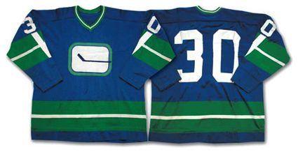
 Now we get to the team with the most prolific jersey history in the NHL, the Vancouver Canucks. Vancouver came in prior to the 1970-71 season but has left a huge impact on the league as far as their uniforms are concerned. The team has gone through 13 changes to logos and color schemes; some good and some not so much. First up: the team's original jerseys from 1970-78. Although there were a few alterations during those seasons (the first season they had a different stripe pattern on the sleeves and the latter ones featured names for the first time), the overall look stayed the same. Given the nickname the "stick in a rink" jerseys, these uniforms went with a basic appeal: solid blue, green and white colors and a simplistic logo that when you look closer the stick gives the background the look of a giant "C" for Canucks. One dominant stripe forms on the bottom and sleeve areas that are accented by other colored stripes (normally one on each side) to again appeal to the simple design.
 My final thoughts: Quite honestly these are the best jerseys they've come up with. I've harped on a few teams for minimalistic designs but in the case of the Canucks, they have a pretty solid foundation. Obviously they are a hockey team and have a logo that forms a "V" sort of and a definite "C". These jerseys were brought back by the squad in 2006 in a variation of the original as an alternate. They are also available as a part of the NHL's throwback Heritage collection.
No comments:
Post a Comment