Thursday, October 10, 2013

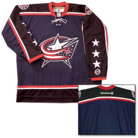
Blue Jackets 3rd Jersey 2010-Present

 
The Blue Jackets are the 4th and final team of the "new age" expansion era teams that I haven't covered yet. Columbus was awarded a franchise in 1997 but didn't start playing puck until the 2000-01 season. The team was named after the state's illustrious history with the Civil War. Ohio played a huge part in the Civil War by starting up 23 volunteer infantry regiments for the Union, creating some of the largest military bases at the time and producing some of the war's most prominent members such as Ulysses S. Grant, William Tecumseh Sherman and George Custer.

Why should I mention history when this blog is about hockey jerseys? Well I wanted to reflect the impact that the state's history has on the team, so much so that it created this classic 3rd jersey in 2010 to take over from the swooping stars and stripes alternate. (The logo from that original alternate sweater eventually would replace the team's old one from 2007 to the present day). The new logo features a circular design with a cannon and the team's name over top. Navy blue reflects the color of the original "Blue Jackets" and benefits from the use of lighter blue and white as complements.


My final thoughts: Definitely a great example of a 3rd jersey working out. It has a great reputation around the league and from critics as an excellent alternate and I have to agree wholeheartedly. Their meshing of history and hockey is really quite awesome, ranging from the team name to the use of a replica cannon at home games to signify goals and team wins. A must have for any hockey fan.

Nashville Predators Alternate 2001-07


I mentioned in the Sabres 3rd jersey article that the extended use of yellow for a team's alternate jersey has had some disastrous results. The Predators created this dud prior to their 4th season in the NHL in an attempt to bring a new look to the team as well as sell merchandise because the team's popularity had not taken off as well as they had hoped. The end result was quite frankly a train wreck. Instead of using the team's gold yellow color, they opted to use a mustard yellow tint for the primary color (pretty bad choice on their part). The jersey features dark blue on the areas under the armpit and ribs that connect to swirling gray and white stripes inside the aforementioned blue color. This addition is awkward looking and adds to the jersey's ineffectiveness. The final straw that broke the camel's back here is the modification of the Predators logo. Now I think that the team's original logo is one of the better ones in the NHL; it's detailed, unique and intimidating. But on this jersey, the logo is turned into a caricature and a total joke. The saber tooth tiger here looks more like something you might find in the Ice Age films. Is "Gnash" smiling, staring off in a contemplative manner or trying his hardest to be serious? I can't tell and neither can most fans.
My final thoughts: The Predators have become a successful organization after dismissing this ugly sweater from their repertoire. They've gained credibility and have sustained a high rate of ticket sales since this jersey made its last appearance. Need I say more?

Tuesday, October 8, 2013

1979-85 Hartford Whalers

The Whalers started out as a team in the old World Hockey Association (WHA), which was a new league established to compete with the NHL. Although the WHA didn't last very long, the Whalers were brought into the fold when the NHL expanded in 1979. The team lasted 18 seasons as a member of the NHL, compiling a record of 534 wins, 709 losses and 177 ties. Even though their franchise numbers were bad, the team featured one of the more unique logos and color schemes during its tenure. And what better to examine than the team's original jersey.

Green is the primary color for the home sweater worn from 1979 to 1985 and it sure does work well. The sleeves feature an angular pattern with a blue stripe in between two larger white stripes. The bottom of the jersey also utilizes this stripe pattern. The logo combined with the colors and shoulder patch are what does it for me. The Whalers logo incorporates the letter W with a tail of a whale over top. In the negative space between the two, there appears to be a "H" for Hartford. The shoulder patch, seen more clearly here, is a relatively small and possibly confused whale affectionately named "Pucky". The diminutive whale was a staple on their jerseys during this time period, but were removed from the 1985-86 season until the team's demise in 1997. "Pucky" came back in a big way when the NHL Store decided to create a Vintage clothing line with all the now defunct franchises.

My final thoughts: One of the coolest vintage jerseys out there without a doubt. I wish I would have been alive then to see them play just because how nice these jerseys are. They weren't a successful team but have remained popular due to their merchandise. I own two Hartford Whalers t-shirts and can't wait to get one of their jerseys.


Monday, October 7, 2013

Buffalo Sabres 2013 Alternate Jersey

http://www.icethetics.info/storage/blog13/0904-buf-3rdfull.png?__SQUARESPACE_CACHEVERSION=1378746967101
Yikes! Alternate jerseys, or third jerseys as they are commonly referred to, have normally been criticized and maligned because they try to incorporate new aspects that have nothing to do with the team's logo or colors.This one is no exception. Sabres forward and co-captain Steve Ott leaked photos of their new duds prior to the season which led to a huge backlash from fans. No wonder why Sabres fans are so depressed; they've been to the Stanley Cup Finals twice in 32 years (losing both in heart-breaking fashion), they're in the process of yet another rebuild, their two star players want out and now this. What isn't there to love?

Let's start with the color scheme. Didn't the Sabres learn anything from the Predators when they used a bright yellow shade as the primary and failed miserably? Although not exactly Colonel Mustard like, the use of yellow for this particular jersey is just as awful. Another strange addition is the use of grey. It's not a featured color for their normal jerseys or in the logo so why is it on there? And why is there so much of it? The numbers would look better if they had gold inside instead of grey. And what's with the partial dark blue back? It's uneven with the front and gives it a goofy look. The new age font for the numbers and colors don't work well either. About the only thing right with this jersey is the Sabres sword logo.

My final thoughts: Worst jersey in NHL history. That's it.

Philadelphia Flyers Away Jersey 2010-Present


Even though the Flyers were a member of the NHL's first expansion era in 1967, the team has carved out a tradition that rivals teams from the Original Six. Their jersey patterns also reflect this sentiment. The team's logo has never been altered during its 47 years of existence. A few of the jerseys have had different stylized aspects changed ranging from the shoulder patterns, outlined names and numbers and the incorporation of stripes. The Flyers tweaked with their home and away sweaters prior to the 2010-11 season to give them a look that harkened back to the team's beginnings. They ditched the black jerseys and made the orange alternate their new home jersey and changed the sleeve patterns. While both look sharp, the one I want to focus on is their visiting whites.

I tend to focus more on the dark colored jerseys because they have more characteristics to applaud or pick at but these away whites are the nicest you might come across. The two features that stick out to me are the the black borders around the numbers on the back and the arms and the "nameplate". The use of an outline on the numbers helps define them and makes them stand out better as opposed to no border. The nameplate is also a cool feature because the names are clearly visible on the black background, which is helpful for anyone who attends or covers a Flyers game. The nameplate was used in the early stages of the NHL so the fact that they brought it back is awesome. It gives the jersey a vintage feel to it.

My final thoughts: Probably the best white jersey circulating out there. The nameplate feature sets it apart from other light jerseys and gives it a unique look in order to stand out in a pack of rather boring away sweaters.

Saturday, October 5, 2013

New York Rangers Statue of Liberty 1996-2007

The Rangers have a storied history in the National Hockey League because they belong to the highly respected Original Six group. The Original Six were the first six teams in the history of the league which was comprised of the Chicago Blackhawks, Detroit Red Wings, Montreal Canadiens, Toronto Maple Leafs, Boston Bruins and the Rangers. Being a traditional team, the Rangers have had the same jersey pattern for most of their history, featuring a red, white and blue color scheme, stripes on the sleeves and bottom of the jersey and using the diagonal Rangers pattern on the front instead of the team's logo. The team decided to change things up in 1996 by creating what is considered the "Statue of Liberty" jersey to use as an alternate.

This jersey pattern was well received by fans and there's no wonder why. The jersey features the head of the Statue of Liberty placed inside of the Rangers usual logo and the abbreviated NYR resting underneath the new logo. The team changed up the color scheme just slightly by featuring navy blue as the main color and adding silver stripes to compliment the gray used for the statue.

My final thoughts: Although the team did not have a whole lot of success during the years that they used these jerseys (339-362 with 77 ties and 42 overtime or shootout losses), they sure were popular with fans and sports jersey critics. Using the Statue of Liberty as the new logo was a nice touch; giving the team a new identity while showing history about the city. Nicely done Rangers.

Tuesday, October 1, 2013

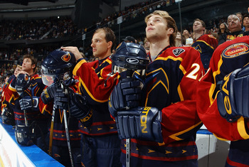
Atlanta Thrashers Home/Alternate Jersey 2003-2011

 
The Atlanta Thrashers came into the league during the 1999-2000 NHL season as a part of the 4 team expansion era with Nashville, Columbus and Minnesota. Unlike those 3 teams, the Thrashers had ownership issues, problems with selling tickets and their products and ultimately sold the team to an ownership group based out of Winnipeg in the Manitoba province of Canada. With an atrocious jersey like this one, which they wore for most of their home games, it's no wonder why nobody wanted to come to games or buy their merchandise.

So what's so wrong with it? Well for starters, there's the whole blinding color scheme with "Thrasher Ice Blue" taking up most of the jersey. It's such a terrible color choice and yet they felt that it was smart to make most of the jersey that color. It's not even one of the original team colors so the use of this color is unnecessary and a huge mistake. Then we get to the sleeves. One side features the old Thrashers logo, which looks fine to me. But then they decided to add a dark blue color and the bold-faced Atlanta to the left side sleeve. Who thought that was a good idea? The concept comes across as second rate; a thought shared by the author of this story. It's almost as if they thought about using that design for the whole jersey but scrapped the idea and just threw it on there. The use of red, white and blue on the dark sleeve pattern comes across as tacky.

My final thoughts: Truly a horrendous jersey design. This is hockey after all, not soccer or football where jerseys like this one would be more common and accepted. The Thrasher Ice Blue color does not exude masculinity, therefore making anyone who wears it feel emasculated. No wonder why they only made the playoffs once in 12 seasons. They were better off with their original home sweater.