My final thoughts: Bring them back please! One of the only teams to ever pull off purple of a jersey scheme. The team is in its 20th season so they brought them back for one game but their new jerseys are lame and boring so why not replace them with these awesome jerseys? Just a suggestion. I know Ducks fans agree with me.
Wednesday, October 30, 2013
Mighty Ducks of Anaheim Away 1993-2006
My final thoughts: Bring them back please! One of the only teams to ever pull off purple of a jersey scheme. The team is in its 20th season so they brought them back for one game but their new jerseys are lame and boring so why not replace them with these awesome jerseys? Just a suggestion. I know Ducks fans agree with me.
Monday, October 28, 2013
Edmonton Oilers alternate 2001-07
Much like the majority of the Canadian teams, the Edmonton Oilers tend to be traditional and stick to what suits them best. But like most teams during the time period, the team adopted this interesting third jersey prior to their season in 2001. The design can be credited to minority owner Todd McFarlane (yeah that Todd McFarlane of Spawn fame). The team's logo was replaced by a flying set of gears with an oil drop on the inside, the primary colors were changed from blue and orange to dark blue and silver and the fonts used for the name and number were changed to a futuristic font. The gears on the logo feature 5 notches to celebrate the team's 5 Stanley Cup Championships which is a pretty unique aspect.
My final thoughts: Where a lot of teams went wrong with their third jerseys, the Oilers did a great job coming up with a design that is different but memorable. Although a departure from their normal colors, I liked the combination of dark blue with the grey and white stripes. It comes together really well for it being a 3rd jersey. I've been critical of darker colored jerseys but this one is sharp and proves the point that alternate jerseys do have a place in sports.
Dallas Stars alternate 2003-2006
While we're on the subject of livestock...
My final thoughts: NHL teams insistence on designing alternate jerseys has led to plenty of terrible choices, including this one. The fact that they didn't realize the jersey had a logo that looked like a part of the female anatomy goes to show how smart the people were behind its approval.
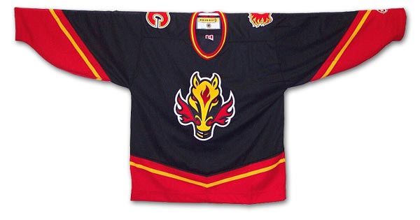
Calgary Flames Alternate/Away 1998-2006
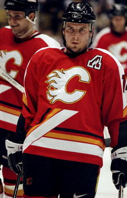
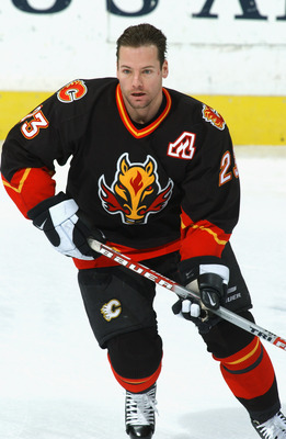
As you can see with this one, the team incorporated black for their primary color (a popular choice by most teams for their alternate jerseys) and scaled back on the use of red and yellow. The biggest change of course is the main flaming "C" logo being pushed to the shoulder patch and the invention of what has been called the "Flaming Horse". The idea came about because 1998 was "The Year of the Cowboy" so some dimwit decided it would be cool to create a logo featuring a horse that appears to have jaundice, sports devil ears and has flames shooting out of its nostrils to the side for some strange reason (not to mention the flame "birthmark" on the head). The only problem with this is that well it's a disaster. The proper line of reasoning would be to use a dragon because although they are mythical, they have been known to breathe fire (just saying). I'm actually surprised that Calgary kept this thing around for that long.
My final thoughts: Among their third jersey brethren, it ranks up there with one of the more poorly executed designs. The one cool feature is the patch designating captain or assistant captain seen here. Luckily they have kept that and got rid of the horse. I think maybe even Oilers coach Craig MacTavish might have hated it too; I mean look what he did to their mascot.
Thursday, October 17, 2013
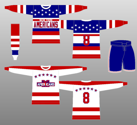
New York Americans 1930-38
A large spread of patriotism throughout the United States led to the creation of the franchise and its tributes to the nation's colors. Instead of a logo in the middle section, the team opted to use small script New York over top of a large script Americans. The jersey features the stars on the front and back, the red stripes along the sleeves and bottom section and a white mid section for the logo and number on the back.
My final thoughts: A great American jersey. Probably the most patriotic jersey ever manufactured and should have been worthy of use in the Olympics (minus the New York part of course). This is definitely a collectors item for any jersey fanatic out there.
Wednesday, October 16, 2013
San Jose Sharks Home/Away 1998-2007
The final team to cover from the league's Californian expansion is the San Jose Sharks. Entering the league in 1991, the Sharks have grown into one of the most popular franchises in the NHL. The team's fan base is one of the loudest and most loyal in the league and were considered so intimidating that the Sharks arena carries the nickname of the "Shark Tank". These jerseys were first born during the 97-98 season as an alternate but eventually became the team's go-to jersey for away games starting the next year. The arched name format and slim numbers are winners and the incorporation of a black arch on the front just adds fuel to an awesome fire. The Shark's logo is intense as it should be and the use of black and gray along the tops of the jerseys bring to mind the appearance of a shark. It makes for an intimidating presence on the ice.
My final thoughts: One of my favorite jerseys from one of my favorite teams. I love the use of teal and the menacing shark logo. The team has done this jersey a great injustice since the team's "upgrade" in 2007. If it were me, I would love for the Sharks to bring back these jerseys and keep them full time (or maybe as an alternate). Lots of nostalgia involved with this uniform with a few of my favorite players (captains Owen Nolan and Patrick Marleau pictured here) putting this on game after game. Essentially the start of the franchise's success began around the time these jerseys were introduced.
Mighty Ducks of Anaheim Alternate 1995-96
Staying with the 90s alternate theme, another Californian team went with a dramatic design. This wildly entertaining addition to the 3rd jersey family was also given a nickname, "Wild Wing", after the team's mascot. The Disney owned Mighty Ducks were awarded a franchise in 1993 and named after the popular movie The Mighty Ducks starring Emilio Estevez as the coach of a hockey team made up of misfits who defy the odds and win a championship. The film was so well received by hockey fans that Disney made a huge decision to create a professional hockey team in Anaheim and give them the Mighty Ducks name. A cartoon television show accompanied the team's arrival, with "Wild Wing" serving as the protagonist.
The cartoon tie-in is a prominent feature on this jersey. On the front we see Wild Wing jumping through the ice, flying in the air with the home Mighty Ducks uniform on and wearing goalie equipment. The stripe pattern on the sleeve is the opposite of the home and away sweaters due to the main color of teal. The normal logo is placed on the shoulder patch and the stripe pattern that is featured on the backs of their other jerseys is done away with. The number/name font was changed to an artistic style, giving it a unique look. My opinion of this jersey is that it's absolute madness and almost comical, yet it does have an appeal. It's one of those "it's so crazy it just might work" type jerseys so I could be critical but I'm not sure if I should be.
My final thoughts: I was and am still a huge fan of the Mighty Ducks, both the jerseys and the movies (well maybe not D3). This jersey is one of the most unique ones I've ever seen and even though it caters more to children than adults, it is a pretty interesting design. Much like L.A.'s "Burger King", this jersey lasted only one season. It continues to be maligned however as this blog list shows.
Subscribe to:
Posts (Atom)